Long-form video podcasts represent some of the highest-value content on YouTube today. However, they face a steep hurdle: asking a viewer to invest 60 to 120 minutes of their day requires exceptional trust.
Unlike fast-paced entertainment videos, podcast thumbnails must communicate intimacy, intellectual stimulation, and authentic human chemistry. When designing for prominent creators like Sajan Shrestha, Biswa Limbu, and podcast channels across Nepal, I adhere to a specific visual framework.
1. Managing Host-to-Guest Eye Lines
In a two-person interview layout, the angle of the subjects' gazes dictates the subconscious feeling of the conversation.
- Facing Inward: When host and guest face inward toward each other with intense expressions, it communicates high tension, heated debate, or intimate revelation.
- Facing the Viewer: When the guest looks directly at the camera while the host reacts candidly, it invites the viewer into the room as a third participant.
Never use two headshots looking out of the frame in opposite directions. It visually disconnects the subjects and makes the thumbnail feel disjointed.
2. The Superiority of Unscripted Facial Expressions
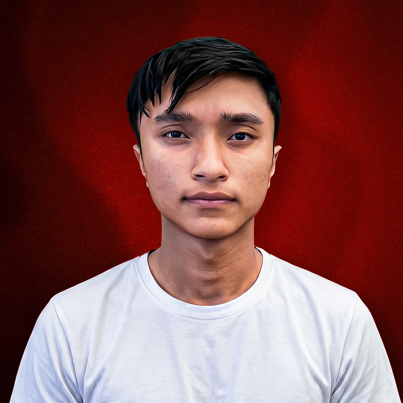
Too many podcast creators send their designer the guest's official corporate headshot or a posed photoshoot picture. Posed smiles look sterile and remind viewers of boring corporate webinars.
I always ask podcast producers to pull high-resolution screen grabs directly from the video timeline at the moment of peak emotion: an uninhibited burst of laughter, a pensive moment of confession, or wide-eyed disbelief. These micro-expressions trigger genuine empathy.
"Authenticity is the currency of podcasting. A slightly imperfect candid reaction will outperform a polished, airbrushed studio headshot every single time."
3. Establishing Series Consistency Without Boredom
Podcast channels release dozens of episodes each year. If every thumbnail looks identical (same background, same font, same layout), subscribers experience "feed blindness" and skip new uploads assuming they've already seen them.
To solve this, I establish a consistent branding spine—such as signature lighting tones and host placement—while varying the background accent colors and guest framing for each specific episode.
4. Studio Atmosphere & Background Separation
Raw podcast studio backgrounds are often crowded with microphones, soundproofing foam, and black boom arms. In Photoshop, I cleanly isolate the subjects, softly blur and darken the studio backdrop, and introduce colored rim lighting that accentuates silhouettes while maintaining clean depth.
Launching or Scaling a Video Podcast?
Let's build a dedicated, high-CTR thumbnail template and episode artwork for your show.
Chat on WhatsApp with Ajaya